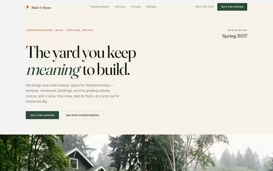
Alder & Stone
Design–build landscapers in Portland with genuinely beautiful work and no way to prove it. Referrals carried the business; the website actively cost them jobs.
- Brand
- Website
- Photography direction
The work was invisible before anyone got to the driveway.
Landscape design is a before-and-after business, and every competitor in the market posts the same thing: a gallery of finished beds with no sense of what was there first. A finished garden photographs well and says nothing about the skill involved.
The other problem was money. Their average project is five figures, and the old site said nothing about that until a discovery call — so half of every week went to quoting people who were never going to buy.
Three decisions that carried it.
- 01
Made the transformation the interface
A drag-to-compare slider on every project, so a visitor does the before-and-after themselves. It takes about two seconds of interaction to understand what these people actually do.
- 02
Put the money on the page
Project ranges stated plainly in the services section. Fewer enquiries, materially better ones — the site does the first round of qualifying now.
- 03
Built the estimate flow around the property, not the form
Address, scope, photos, timeline. Four steps that read like a conversation instead of an intake form, and it saves progress if they bail halfway.
A site that argues for craftsmanship instead of asserting it, and screens out the wrong jobs before they reach a human.
- Next.js
- Motion
- Custom CMS-ready content layer